In this notebook we aim to predict the distribution of
when
with automatic differentiation. This is a follow-up to the previous notebook How do distributions transform under a change of variables ?, which relied on traditional transformation methods without automatic differentiation..
# Import necessary libraries
import numpy as np
import scipy.stats as scs
import matplotlib.pyplot as plt
# Define normal distribution parameters
mean, std, N = 1.0, 0.3, 10000 # Mean, standard deviation, and number of samples
# Generate random samples from a normal distribution
x = np.random.normal(mean, std, N)x_plot = np.linspace(0.1,3,100)# Plot histogram of sampled data
plt.figure(figsize=(8, 5))
plt.hist(x, bins=50, density=True, alpha=0.6, color='blue', edgecolor='black')
# Overlay the theoretical normal distribution
x_plot = np.linspace(0.1, 3, 100)
plt.plot(x_plot, scs.norm.pdf(x_plot, mean, std), 'r-', linewidth=2, label='Theoretical PDF')
# Formatting the plot
plt.xlabel('x')
plt.ylabel('Density')
plt.title('Histogram of Normally Distributed Samples')
plt.legend()
plt.grid(alpha=0.3)
plt.show()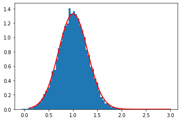
def q(x):
return 1/xq_ = q(x)
q_plot = q(x_plot)# Plot histogram of sampled data
plt.figure(figsize=(8, 5))
plt.hist(x, bins=50, density=True, alpha=0.6, color='blue', edgecolor='black')
# Overlay the theoretical normal distribution
x_plot = np.linspace(0.1, 3, 100)
plt.plot(x_plot, scs.norm.pdf(x_plot, mean, std), 'r-', linewidth=2, label='Theoretical PDF')
# Formatting the plot
plt.xlabel('x')
plt.ylabel('Density')
plt.title('Histogram of Normally Distributed Samples')
plt.legend()
plt.grid(alpha=0.3)
plt.show()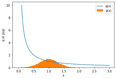
# Plot histogram of sampled data
plt.figure(figsize=(8, 5))
plt.hist(x, bins=50, density=True, alpha=0.6, color='blue', edgecolor='black')

# Overlay the theoretical normal distribution
x_plot = np.linspace(0.1, 3, 100)
plt.plot(x_plot, scs.norm.pdf(x_plot, mean, std), 'r-', linewidth=2, label='Theoretical PDF')

# Formatting the plot
plt.xlabel('x')
plt.ylabel('Density')
plt.title('Histogram of Normally Distributed Samples')
plt.legend()
plt.grid(alpha=0.3)
plt.show()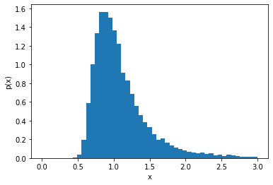
Do it by hand
We want to evaluate , which requires knowing the deriviative and how to invert from . The inversion is easy, it’s just . The derivative is , which in terms of is .
# Plot histogram of sampled data
plt.figure(figsize=(8, 5))
plt.hist(x, bins=50, density=True, alpha=0.6, color='blue', edgecolor='black')

# Overlay the theoretical normal distribution
x_plot = np.linspace(0.1, 3, 100)
plt.plot(x_plot, scs.norm.pdf(x_plot, mean, std), 'r-', linewidth=2, label='Theoretical PDF')

# Formatting the plot
plt.xlabel('x')
plt.ylabel('Density')
plt.title('Histogram of Normally Distributed Samples')
plt.legend()
plt.grid(alpha=0.3)
plt.show()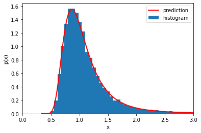
Alternatively, we don’t need to know how to invert . Instead, we can start with x_plot and use the evaluated pairs (x_plot, q_plot=q(x_plot)). Then we can just use x_plot when we want .
Here is a plot of the inverse mad ethat way.
plt.plot(q_plot, x_plot, c='r', lw=2, label='inverse x(q)')
plt.xlim((0,3))
plt.xlabel('q')
plt.ylabel('x(q)')
plt.legend()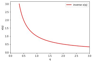
and here is a plot of our prediction using x_plot directly
# Plot histogram of sampled data
plt.figure(figsize=(8, 5))
plt.hist(x, bins=50, density=True, alpha=0.6, color='blue', edgecolor='black')

# Overlay the theoretical normal distribution
x_plot = np.linspace(0.1, 3, 100)
plt.plot(x_plot, scs.norm.pdf(x_plot, mean, std), 'r-', linewidth=2, label='Theoretical PDF')

# Formatting the plot
plt.xlabel('x')
plt.ylabel('Density')
plt.title('Histogram of Normally Distributed Samples')
plt.legend()
plt.grid(alpha=0.3)
plt.show()With Jax Autodiff for the derivatives
Now let’s do the same thing using Jax to calculate the derivatives. We will make a new function dq by applying the grad function of Jax to our own function q (eg. dq = grad(q)).
from jax import grad, vmap
import jax.numpy as np#define the gradient with grad(q)
dq = grad(q) #dq is a new python function
print(dq(.5)) # should be -4-4.0
/Users/cranmer/anaconda3/envs/stat-ds-book/lib/python3.8/site-packages/jax/lib/xla_bridge.py:130: UserWarning: No GPU/TPU found, falling back to CPU.
warnings.warn('No GPU/TPU found, falling back to CPU.')
# dq(x) #broadcasting won't work. Gives error:
# Gradient only defined for scalar-output functions. Output had shape: (10000,).#define the gradient with grad(q) that works with broadcasting
dq = vmap(grad(q))#print dq/dx for x=0.5, 1, 2
# it should be -1/x^2 =. -4, 1, -0.25
dq( np.array([.5, 1, 2.]))DeviceArray([-4. , -1. , -0.25], dtype=float32)#plot gradient
plt.plot(x_plot, -np.power(x_plot,-2), c='black', lw=2, label='-1/x^2')
plt.plot(x_plot, dq(x_plot), c='r', lw=2, ls='dashed', label='dq/dx from jax')
plt.xlabel('x')
plt.ylabel('dq/dx')
plt.legend()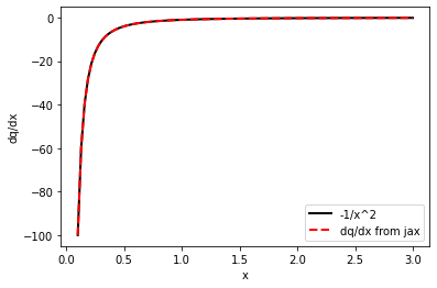
We want to evaluate
,
which requires knowing how to invert from . That’s easy, it’s just . But we also have evaluated pairs (x_plot, q_plot), so we can just use x_plot when we want
Put it all together.
Again we can either invert x(q) by hand and use Jax for derivative:
# Plot histogram of sampled data
plt.figure(figsize=(8, 5))
plt.hist(x, bins=50, density=True, alpha=0.6, color='blue', edgecolor='black')

# Overlay the theoretical normal distribution
x_plot = np.linspace(0.1, 3, 100)
plt.plot(x_plot, scs.norm.pdf(x_plot, mean, std), 'r-', linewidth=2, label='Theoretical PDF')

# Formatting the plot
plt.xlabel('x')
plt.ylabel('Density')
plt.title('Histogram of Normally Distributed Samples')
plt.legend()
plt.grid(alpha=0.3)
plt.show()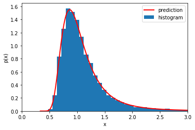
or we can use the pairs x_plot, q_plot
# Plot histogram of sampled data
plt.figure(figsize=(8, 5))
plt.hist(x, bins=50, density=True, alpha=0.6, color='blue', edgecolor='black')

# Overlay the theoretical normal distribution
x_plot = np.linspace(0.1, 3, 100)
plt.plot(x_plot, scs.norm.pdf(x_plot, mean, std), 'r-', linewidth=2, label='Theoretical PDF')

# Formatting the plot
plt.xlabel('x')
plt.ylabel('Density')
plt.title('Histogram of Normally Distributed Samples')
plt.legend()
plt.grid(alpha=0.3)
plt.show()