Plotting#
import numpy as np
import pandas as pd
import matplotlib.pyplot as plt
Using plt for quick plots#
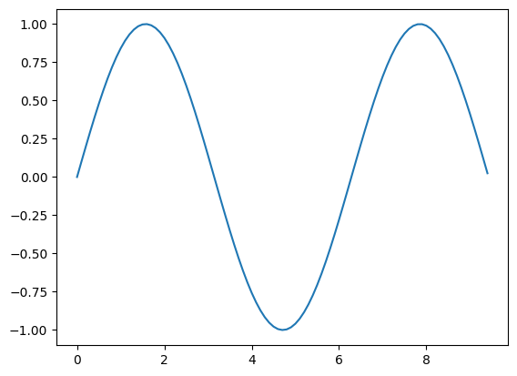
Matplotlib is the most widely used plotting library in the ecosystem of python. In the above cel we loaded matplotlib and the relevant libraries.
The easiest way to use
matplotlibis via pyplot, which allows you to plot 1D and 2D data. Here is a simple example:
# Compute the x and y coordinates for points on a sine curve
x = np.arange(0, 3 * np.pi, 0.1)
y = np.sin(x)
# Plot the points using matplotlib
plt.plot(x, y)
[<matplotlib.lines.Line2D at 0x7ff0fa6e9430>]
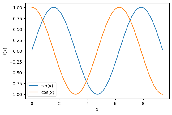
Using fig, ax objects for subplots and more#
For customizing plots it is more convenient to define fig and ax objects.
ax and fig can be manipulated using their methods
One can then use ax object to make veriety of subplots then use fig to save the entire figure as one pdf.
fig, ax = plt.subplots(figsize=(6,4))
x = np.arange(0, 3 * np.pi, 0.1)
y1 = np.sin(x)
y2 = np.cos(x)
# Plot the points using matplotlib
ax.plot(x, y1, label='sin(x)')
ax.plot(x, y2, label='cos(x)')
# Specify labels
ax.set_xlabel('x')
ax.set_ylabel('f(x)')
ax.legend()
#fig.savefig("myfig.pdf")
<matplotlib.legend.Legend at 0x7ff0f8368dc0>
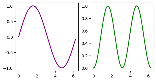
t = np.arange(0.0, 2*np.pi, 0.1) # create x values
s = np.sin(t) # create y values
fig, ax = plt.subplots(nrows=1,ncols=2,figsize=(6,3))
ax[0].plot(t, s, color='purple', lw=2.0) # plot on subplot-1
ax[1].plot(t, s**2, color='green', lw=2.0) # plot on subplot-2
#fig.savefig('sd.png') # save the figure
[<matplotlib.lines.Line2D at 0x7ff0f82bdfa0>]
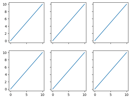
x = range(11)
y = range(11)
fig, ax = plt.subplots(nrows=2, ncols=3,
sharex=True, sharey=True)
for row in ax:
for col in row:
col.plot(x, y)
plt.show()
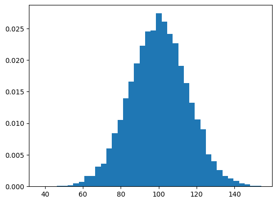
Histogram#
# Make up some random data
mu, sigma = 100, 15
x = mu + sigma * np.random.randn(10000)
# Plot 1D histogram of the data
plt.hist(x, bins=40, density=True);
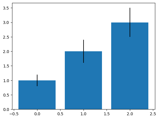
Bar plot#
# input data
means = [1, 2, 3]
stddevs = [0.2, 0.4, 0.5]
bar_labels = ['bar 1', 'bar 2', 'bar 3']
# plot bars
x_pos = list(range(len(bar_labels)))
plt.bar(x_pos, means, yerr=stddevs)
plt.show()
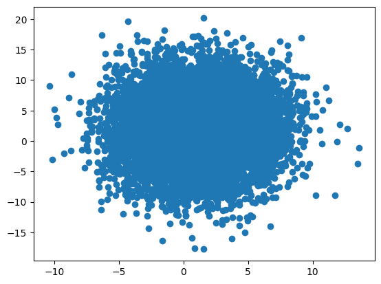
Scatter#
x = 1 + 3 * np.random.randn(10000)
y = 2 + 5 * np.random.randn(10000)
plt.scatter(x,y)
<matplotlib.collections.PathCollection at 0x7ff0f7e02ca0>
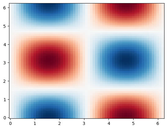
Plotting in 2D#
To make 2D plots we need to generate 2D grid \((x,y)\) of points and pass it to our function \(f(x,y)\)
x = np.arange(0.0, 2*np.pi, 0.1) # create x values
y = np.arange(0.0, 2*np.pi, 0.1) # create y values
X, Y = np.meshgrid(x,y) # tunring 1D array into 2D grids of x and y values
Z = np.sin(X) * np.cos(Y) # feed 2D grids to our 2D function f(x,y)
fig, ax = plt.subplots() # Create fig and ax objects
ax.pcolor(X, Y, Z,cmap='RdBu') # plot
# try also ax.contour, ax.contourf
<matplotlib.collections.PolyCollection at 0x7ff0f7dde4c0>
Matplotlib Widgets#
Suppose we would like to explore how the variation of parameter \(\lambda\) affects the following function of a standing wave:
Make a python-function which creates a plot as a function of a parameter(s) of interest.
Add an interactive widget on top to vary the parameter.
from ipywidgets import widgets, interact, interactive
def wave(phase=0, freq=0.5):
x = np.linspace(0,10,1000)
y = np.sin(freq*x+phase)
plt.plot(x, y)
plt.show()
interactive(wave, phase=(0, 2*np.pi), freq = (0.1, 5))
Interactive plots#
Plotly is large multi-language interactive graphing library that covers Python/Julia/R.
Plotly-express is a high level library for quick visualizations whihc is similiar to seaborn vs matploltib in its philosophy
Complex interacting plots can be created using plotly graph objects.
You can use chatGPT to help you get started and to customize your plots
import plotly.graph_objects as go
# Makeup some data
x = np.outer(np.linspace(-2, 2, 30), np.ones(30))
y = x.copy().T
z = np.cos(x ** 2 + y ** 2)
# Create surface plot
surface = go.Surface(x=x, y=y, z=z)
# Create fig using surface plot
fig = go.Figure(data=[surface])
# Customize fig
fig.update_traces(contours_z=dict(
show=True, usecolormap=True,
highlightcolor="limegreen",
project_z=True))
fig.show()
Animations#
Show code cell source
import matplotlib.animation as animation
from IPython.display import HTML
# Generate random walk data
positions = np.cumsum(np.random.randn(100, 50, 2), axis=0)
def animate():
fig, ax = plt.subplots(figsize=(6, 6))
ax.set_xlim(-20, 20)
ax.set_ylim(-20, 20)
scatter = ax.scatter([], [])
def update(frame):
scatter.set_offsets(positions[frame])
return scatter,
ani = animation.FuncAnimation(fig, update, frames=100, interval=50, blit=True)
plt.close(fig)
return HTML(ani.to_jshtml())
# Run animation
animate()
Additional resoruces.#
Matplotlib has a huge scientific user base. This means that you can always find a good working template of any kind of visualization which you want to make. With basic understanding of matplotlib and some solid googling skills you can go very far. Here are some additional resources that you may find helpful
Once you understand the basics of matplotlib objects you can use ChatGPT or other LLM to build sophisticated plots. Give it a try!